Displaying Data
Generating Appropriate Data Tables and Graphs
Your data, observations, and data analyses (i.e., calculations) are presented in this section. Often, data is presented in tables and figures. It is appropriate to refer to these tables and figures within the text of the Results section, which should be written as a narrative in the past tense.
Tables and figures should have the appropriate descriptive titles as well as sequential Table and Figure numbers (e.g., "Figure 1"). This section should include at least one table that shows summary statistics for your data sets and at least one figure or graph that displays results, patterns or trends in your data (e.g., an x-y scatter plot for a correlation analysis, or a bar or column graph that compares the means of multiple samples).
Characteristics of Properly Formatted Data Tables
- information that is well organized into columns and rows
- variables that are properly labeled
- variables that contain metric units (if needed)
- A complete caption or title that
- begins with a table number (e.g., Table 1. …)
- appears above the table
- describes what data the table is showing
- provides any additional or missing information that is needed to fully understand the table
Characteristics of Properly Formatted Graphs
- properly labeled axes with the first letter of the first word capitalized
- roperly abbreviated metric units--given in parentheses immediately after the label--on the x- and/or y-axis (if needed)
- axes with proper dimensions so that the data points fill the graph
- axes with properly spaced tick marks (i.e., scale)
- the dependent variable on the y-axis
- a complete caption/title that
- begins with a figure number (e.g., Figure 1. …)
- appears below the graph
- describes what the graph is showing
- provides any additional or missing information that is needed to fully understand the graph
Additional resources for displaying your data and data analysis
- https://owl.english.purdue.edu/owl/resource/560/20/
- http://www.ncsu.edu/labwrite/res/res-homepage.htm
- http://www.cvgs.k12.va.us:81/DIGSTATS/
This page was adapted from the following sources:
- NSTA STEM RESEARCH HANDBOOK
- WHS STEM RESEARCH https://sites.google.com/site/whsstemresearch/
What Type of Graph Should You Use?
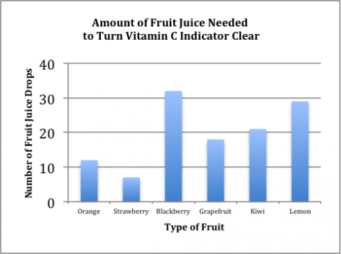
Bar Graph
- shows qualitative data that are divided into categories
- only one axis has numerical scale
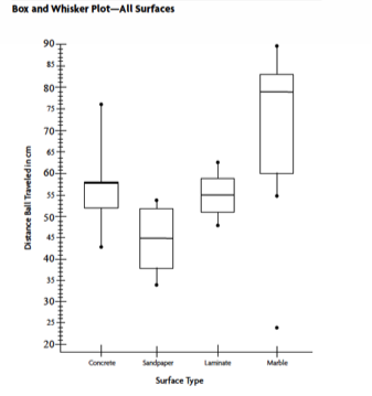
Box and Whisper Plot
- shows distribution of quantitative data
- includes maximums, minimums, outliers, ranges, medians
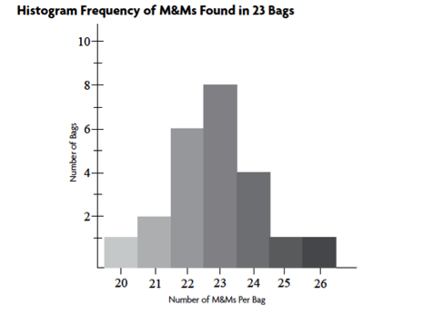
Histogram
- shows distribution of quantitative data
- uses touching bins that indicate frequency of a specific value
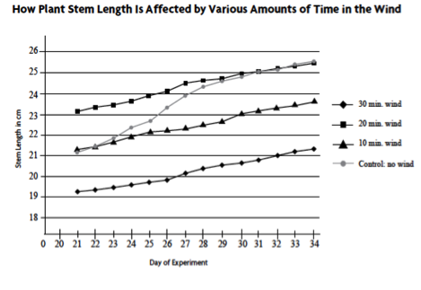
Line Graph
- shows quantitative data that are measured over a period of time, which is usually on the x-axis
- used when both x- and y-axes have continuous scales
- used when the y-value (i.e., dependent) is caused by x-value (i.e., independent)
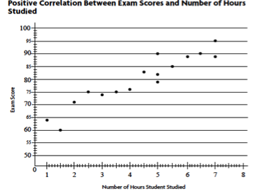
Scatter Plot
- used for quantitative data that displays the independent variable (x-value) and the dependent variable (y-value) as single data points
- often used to determine a positive/negative or no correlation between two variables
- used when you have many data points to examine
- a trend line or curve of best fit may be added
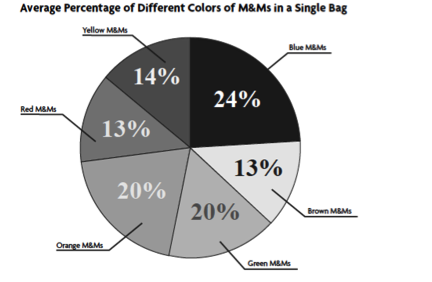
Pie Chart
- shows quantitative data that are distributed shown as percentages
- used when each variable of a whole (100%)